Fourth Wall Studios - RIDES Platform
2012 Emmy Award Winner for Outstanding Creative Achievement in Interactive Media - Original Interactive Television Programming
About Fourth Wall Studios
Fourth Wall Studios was a startup focused on advancing interactive storytelling. The company's main offering, RIDES, was an online multi-screen entertainment platform that combined streaming video with supporting narrative content sent to the user through phone calls, text messages, and emails.
Challenge
A MVP of the RIDES platform had been released to the public but wasn't well received. The platform's latest piece of content was readying completion and a decision was made to quickly redesign the platform in time for that content's release.
My Role
I was VP of Digital Design at the time and took a hands-on role in the redesign by:
- Pitching executives on the value of the redesign
- Scoping the project
- Communicating the scope to product, content creators, and engineers
- Selecting a team
- Defining process for the redesign
- Art directing and overseeing the redesign
- Getting signoff from stakeholders
Summary
In the fall of 2011, Fourth Wall Studios challenged me to redesign their multi-screen entertainment platform before an upcoming content release. Within a month we delivered a product that:
- Improved usability testing results
- Better aligned itself with user mental models
- Provided a framework for our future content releases
Check out the video below to see our completed design.
Design Process
Working through the process below we went from kickoff to launch in a little under three months.
1 - Empathize
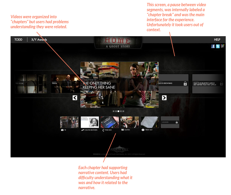
We performed a round of usability testing on the existing design and found these problems:
- The experience centered around a screen with many objects and didn't lend itself to any mental models of our users.
- "Chapters" weren't presented in a way that users understood.
- Supporting narrative content confused users.
Below is an image of the original interface and the problems we found.
We then researched the mental models associated with streaming video to determine why the current design might not be resonating with users. We discovered several points where our design differed:
- A video is presented in one video display window with one scrubber bar representing the entire video.
- All extra content, such as advertisements, is presented within the context of that scrubber bar and video display window.
An advertisement on HBO GO showed in the same video display window, using the same scrubber bar as the main content.
An advertisement on Netflix showed in the same video display window, using the same scrubber bar as the main content.
2 - Define
With a clear understanding of user pain points and mental models we set about defining the requirements of our redesign:
- We would redesign the experience from the point a video was selected to the point the video display window was closed.
- The redesigned experience would take place in a video display window and a scrubber bar would always be present.
- Additional content, phone calls, emails, and text messages, would need to be accessible at any time while in the experience.
- Affordance would need to be made for pauses in video playback where advertisements would be shown and users could explore additional content (phone calls, emails, text messages).
3 - Ideate
We began ideating by brainstorming different layouts that would meet the requirements previously laid out. We presented these two options to executives:
Option 1
Click to zoom
Option 2
Click to zoom
With the layout established we began designing hi-fi mockups:
The interface! Click to zoom.
When a user opted to receive additional content on their phone we prompted them to register. Click to zoom.
A simple token alerted users of phone calls. Click to zoom.
Once received, a small window kept users within context of the phone call they were listening to. Click to zoom.
Text message alerts were also represented by a simple icon. Click to zoom.
If users opted to receive texts on screen instead of on their phone they could read them in a window attached to the timeline for context. Click to zoom.
With our hi-fi mockups complete we began designing the motions and interactions that would bring the designs to life.
One of the many interactions we designed.
4 - Prototype
At the time, late 2011, there were no simple prototyping tools available. Because of that fact, and the short timeline, the decision was made to create a fully functional product and iterate aggressively once usability testing was performed.
Technical specifications had been established early in the process and I worked closely with our engineers to make sure our designs were as easily implemented as possible.
5 - Validation
We engaged in usability testing to great results:
These three tasks were the tasks deemed critical to success of the redesign and we nailed it!
6 - Launch
We launched the redesign and new content to critical acclaim:
LA Times - Fourth Wall Studios does the "Dirty Work" of innovation
Wired - Interactive Web Show Dirty Work Is Engineered for Short Attention Spans
We also won this golden statue. ;)


